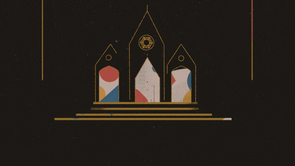
Here we’re looking at a beautifully animated title sequence entitled “Epic” created for a series following the journey around the world in search of important Christian artefacts.
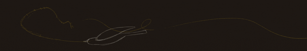
The first thing that stood out in this animation was the constant flow and transition between scenes. A lot of work went into getting the colour and texture balance right, so the blending was seamless. This was no mean feat!
They say a picture is worth a thousand words and this couldn’t be more important here as this opening sequence features absolutely no audible or written clues to the subject matter. It’s a bold move, but one that works well due to the sheer impact of the imagery created.
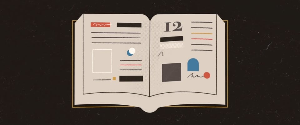
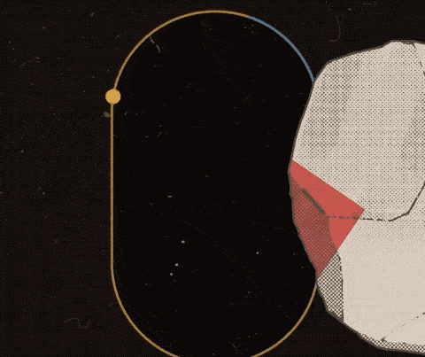
I absolutely love the strong design choices as they give the video an old scavenger map vibe. This is enhanced hugely by the use of only three primary colours, which creates a sharp contrast and therefore demands the viewer’s focus.
This is topped off by the dusty textures and dotted shading, adding the perfect finish to the whole concept.

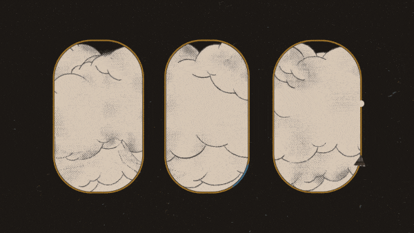
The use of perspective is vital in this animation; going from flat movements to in-depth scenes and back again. The scenes repeatedly switch from simple to complex, ensuring the pace is kept dynamic as well as portraying a real sense of uncertainty and adventure that the story is yet to tell.
Summary
In summary, this animation is a prime example of how styling is not just for aesthetics but is critical in getting your message across. Absolutely everything in the video compliments the story behind it perfectly.
Overall I thought of it as a great style and storytelling execution – everything used in the video compliments the story behind it perfectly.
You can view a full project breakdown by the creator here.