The Concept
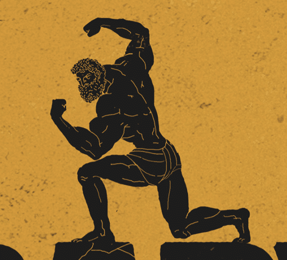
They’ve taken the idea and style from ancient Greek tales of grandeur that were visually told on pottery and spliced it with feats of strength much like that seen in the show “The World’s Strongest Man”. It’s so damn simple, and it works. I absolutely love the colour palette; the darkish yellow perfectly contrasts the dark grey, which also looks to have a hint of yellow.

The Typography
Another clever thing that I didn’t pick up on at first is how the text is framed. It’s either out of shot and being pulled into shot or vice versa. This serves two purposes: giving the character a reason to pull the text and making the text seem more weighty, giving it much more presence on screen. Again, imagining this criticised simply doesn’t feel right.

The Character
Although there were obviously many variations and approaches in the crafting and decoration of ancient Greek pottery, it’s interesting that at a glance, it appears they have removed a lot of elements that would be commonly associated with pottery.
For example, repeating patterns and multiple characters are not present. Instead, they have opted for a clean and sharp aesthetic whilst ensuring the underlying texture of an ancient clay pot remains.
The character himself keeps the traditional silhouette style; however, they have enhanced the anatomy a lot by using more lines to work with the idea of strength.
He’s a muscley boi, and those same line thicknesses are used for the cracks in the letters, harking back to the idea of pottery, immovable objects and strength.
Conclusion
Every visual element helps translate the idea of weight and, supported by the animation, makes the words on screen feel so damn heavy. Showing the character almost struggling to hold, pull and push them around only enhances this. Not to mention the character himself looking tall and muscle-bound yet still tiny compared with the layout of everything else around him in the world. Overall this is a masterclass in finding a simple, yet hugely effective way of giving gravitas to typography.