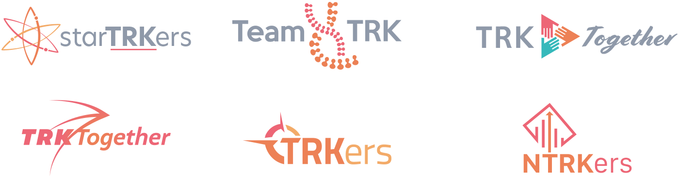
Initial Concepts
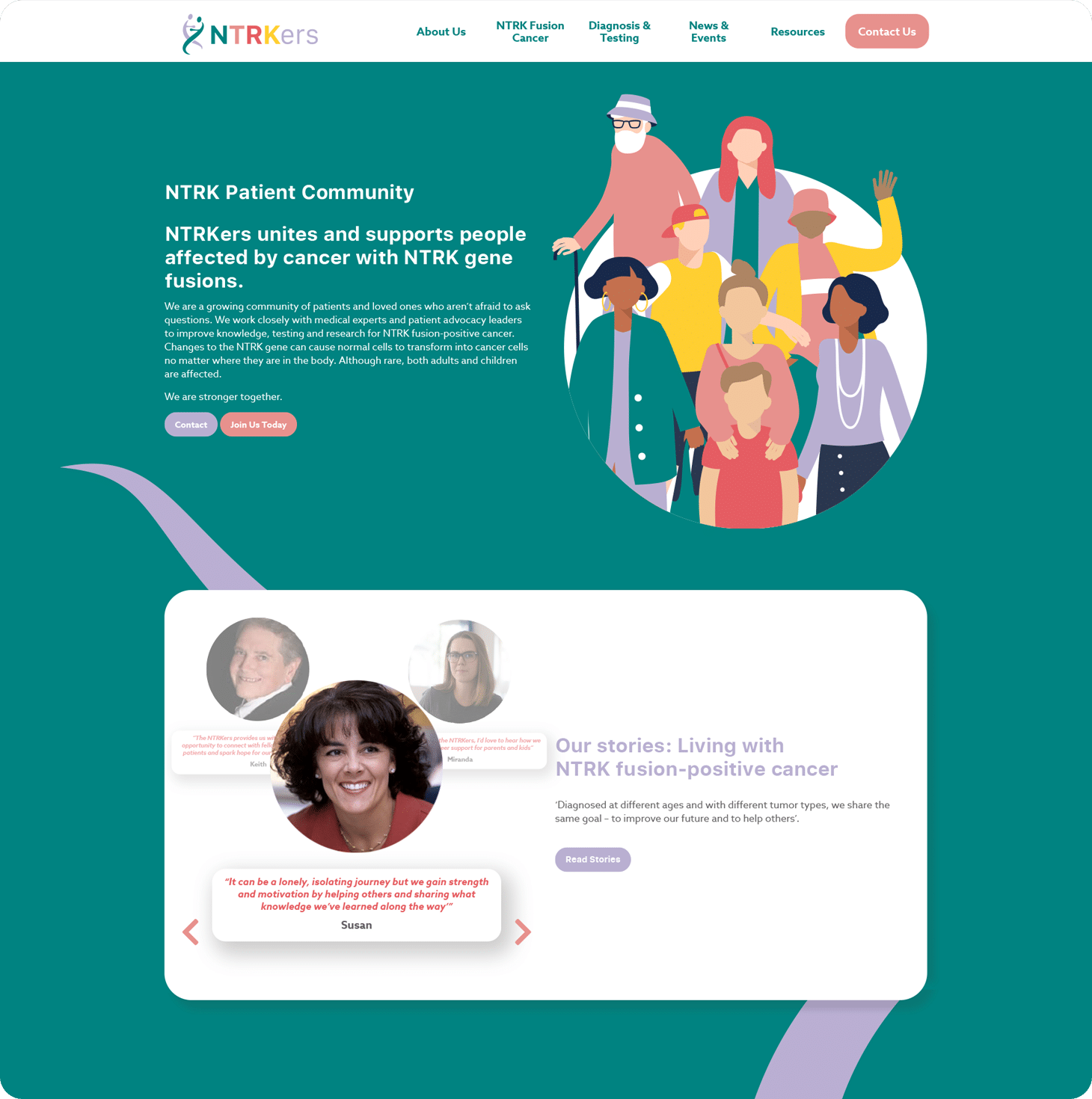
Working closely with medical experts and patient advocacy leaders our client’s main focus was to improve knowledge, testing and research for NTRK fusion-positive cancer. This spirit of collaboration and community was a vital thread that we needed sow into the site’s core design.
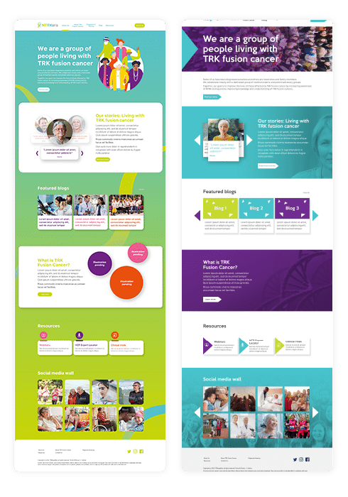
Evolution
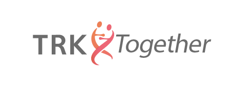
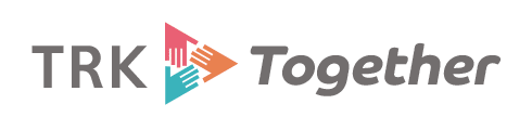
As the identity began to develop and grow, all our efforts were based around showcasing the core ethos of working together for a common goal. This took many forms; ranging from hands working together, a compass to show moving in the right direction, as well as the binding of a DNA helix.

Colour Palette
With content that could easily be heavy to the audience, we wanted to inject some serious colour into the website’s palette. This also represents the diversity within the cancer community, uniting to improve knowledge, testing and research.

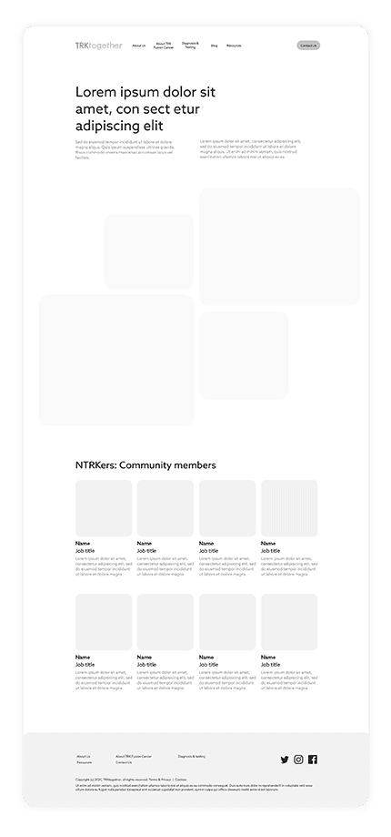
Wireframes
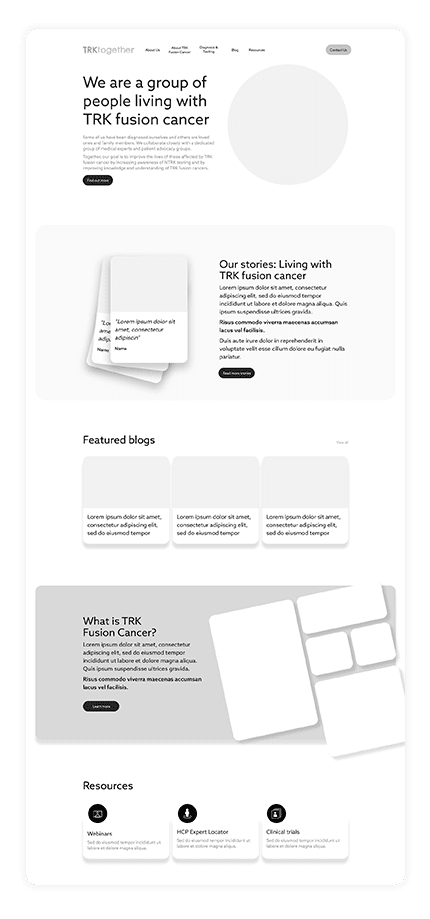
With the style locked down, we wanted to take the information supplied by the client and make sure it was presented in the clearest possible manner. Text-heavy spreadsheets would be broken down into infographics, with difficult subject matters supported with friendlier graphical content.
Design Development
Now it was time to take the colour palette and inject some vibrancy into the wireframes. We wanted to find a balance that was energising, but not overpowering to the audience; using contrasting colours to bring attention to key areas of the site.
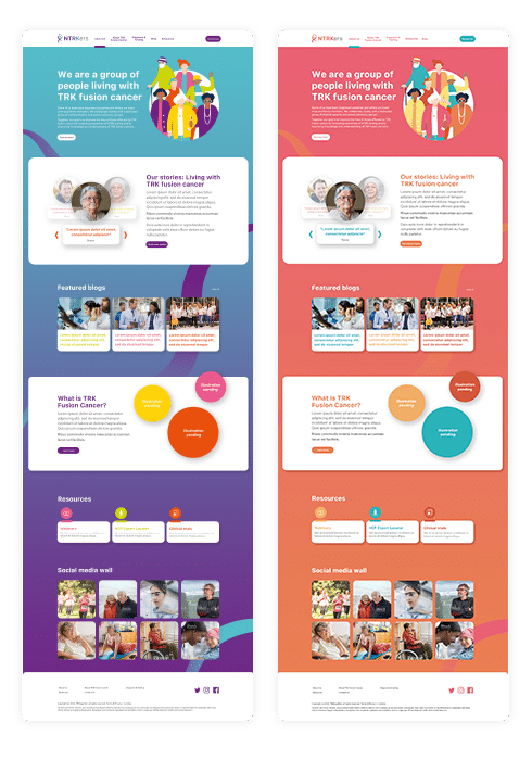
Final Designs
For the final design, we settled on a slightly less saturated version of our master palette. This allowed us to tactically use white space to emphasise specific areas that our client wanted their audience to focus on. This also allowed us to design a range of infographics on clean white backdrops, utilising the rest of the bright palette accordingly.
Infographic Design
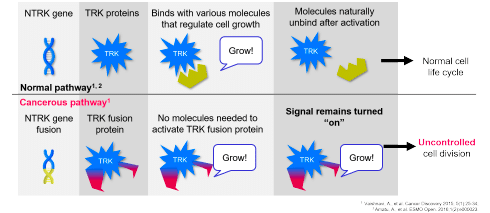
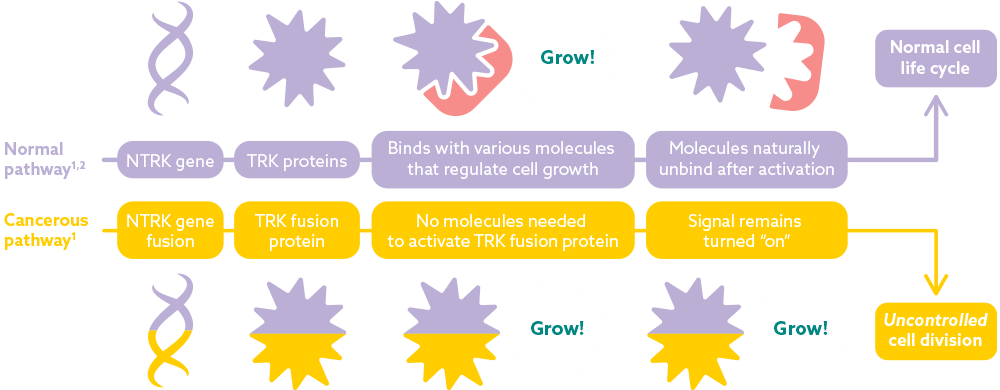
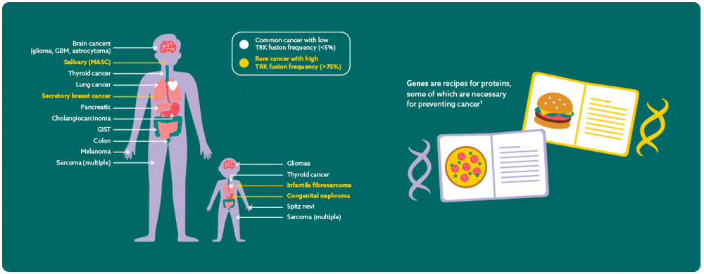
Across all sectors, infographics are being used to communicate complex and sometimes sensitive information in an easily digestible way.
Our client had a series of complex diagrams that required redesigning to make them a lot more palatable to the audience.
Whether it was softening sharp shapes, or finding more pleasing colours, we set about making sure these diagrams were more engaging than their previous incarnations.