Playful, Quirky but Entirely Purposeful
There’s a wonderfully tactile feel to this bright and creative scroller from Google Design. From Haik Avanian’s dancing 3D renderings to the playful palette, there’s a real sense of uniformity and individual quirk at the same time. And beyond all the visual highlights, there’s some excellent content, concentrating on objects designed precisely for their purpose.
Elevating The Content
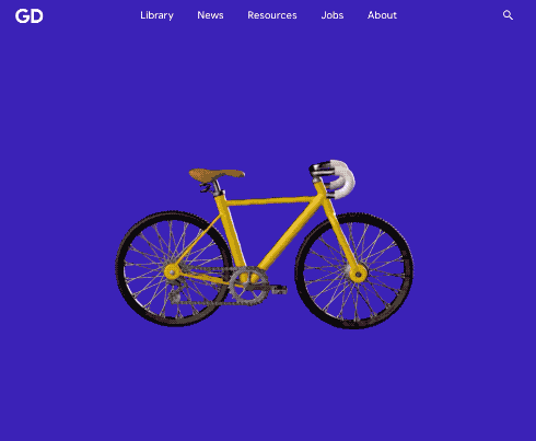
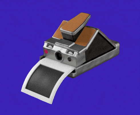
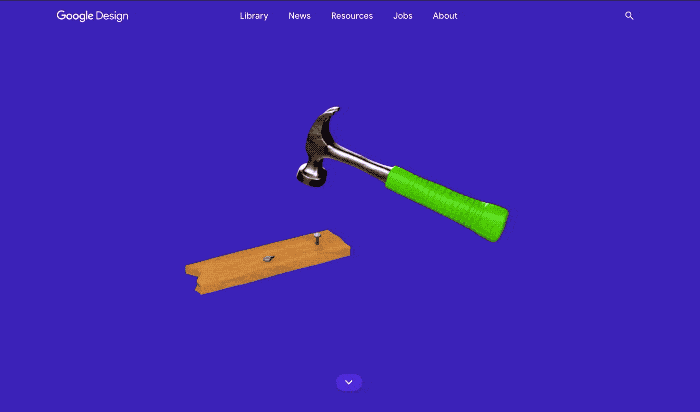
The faux plasticine renders certainly help elevate this piece. The small, looping animations add to their character and form even if they are only subtle motions. The wheelbarrow with soil ebbing and flowing is a great example of this. Some of them, like the Polaroid SX-70, are almost endlessly watchable.
Style Vs Substance
The colours chosen throughout are colourful but shaded in the right places just enough so as not to be garish. The illustrations and animations are already fun enough that the palette doesn’t have to be fully saturated.
The base design is clean and simple and, quite in keeping with the subject matter, it doesn’t do any more than it needs to. The illustrations take centre stage and the copy is given space to breathe on white with no competing elements.
Keep Scrolling
The lighter bluer box expanding as we scroll down introduces us to the wider format nicely, keeping as much visual on display as possible and encouraging the user to keep reading on.
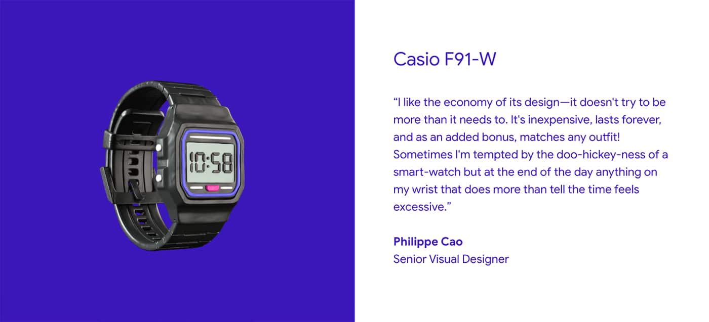
At the heart of this whole piece is some truly great insight from designers of Google products with quotes that really make you think, such as ‘Good design is a healthy mix of the familiar and the future’.
Keeping It Simple
It’s a site that doesn’t overcomplicate, has fun with its subject matter and informs. And, after all, who wouldn’t want to read about Crocs described as ‘utilitarian feet marshmallows’?