Big video meets big interactions.
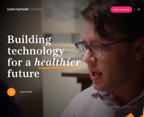
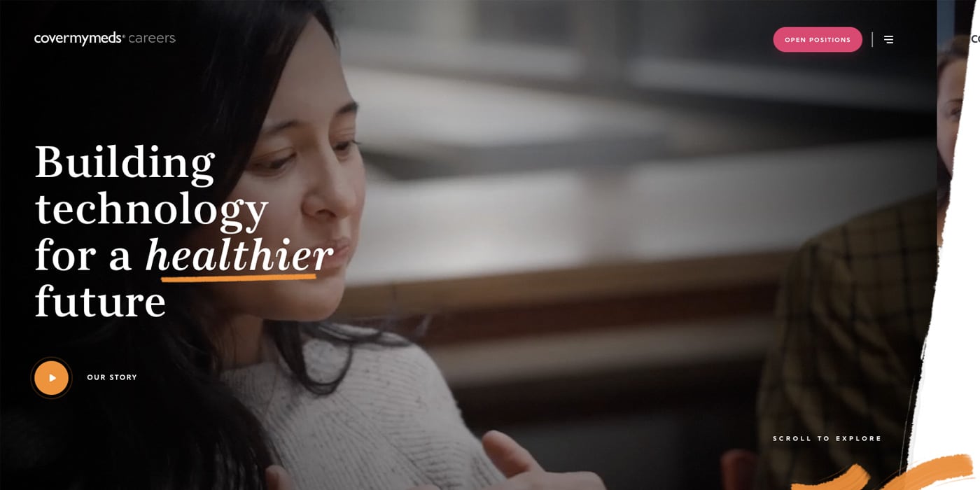
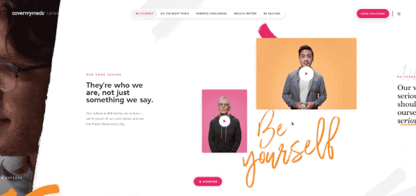
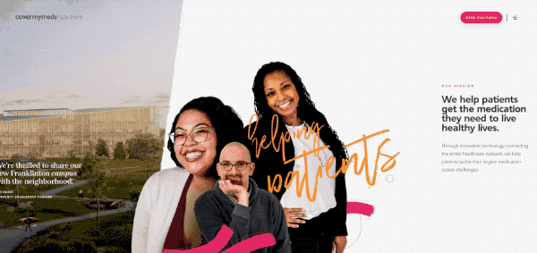
When big video meets big interactions, you know you’re going to get a great website; and Cover My Meds doesn’t disappoint. The first thing that hits you is the full screen video, which for once is also pretty good quality, especially as it’s not a short loop.
The way this site has been built is a prime example of user experience. At no point does it feel like you’re endlessly drilling down into pages of content. Each sections has a purpose and creates a real sense of the site having depth / layers to it.
From a style POV, I really like the subtle content teaser at the bottom right. This is mainly because it’s not just for style and serves as the divider to the next module.
As you scroll along, to keep the main menu nice and minimal, you’re met with these contextual menus at the top of the page. It’s a great way of keeping the sideways scrolling action for top tier pages and preventing the user endlessly scrolling for the sake of it.
Microinteractions are key.
Next you’re met with one of many micro-interactions that prompt the user to play the video content. It’s really subtle, but so engaging and adds to the pseudo-3D depth of the site.
Close caption videos.
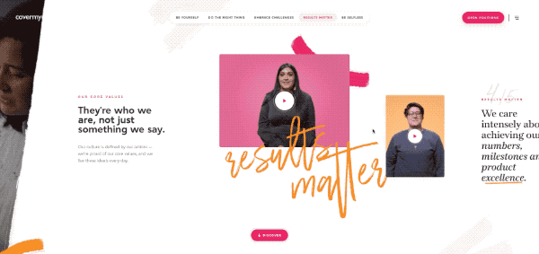
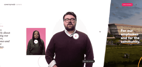
The way that they deal with video interactions is also beautiful. Key videos are automatically playing which muted, with subtle hints to get the user to play them. I really love the closed captions buttons, however I have noticed you cannot turn them off. A very small detail, but something that irked me.
Pseudo 3D objects.
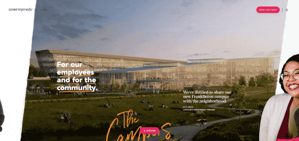
For me, this is probably the only element that doesn’t really serve a purpose, other than to look cool – but it does that very well. In this case there is a parallax effect on the background which relates to the mouse position. I can’t tell if it’s a 3D object that they’re moving, or whether it’s simply multiple layers with different scroll speeds. However whichever it is, it works very well.
Diving into more content.
Each major section that you scroll to also has a button at the bottom which changes depending on the content you’re currently viewing. When you click the button, there’s a really nice page transition that further increases the feeling that you’re not just opening a page, but really diving into some deeper content.
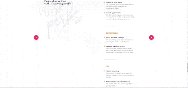
Interactive thumbnails.
Once you’ve dived into this content, there are some beautiful micro-interactions at the base of the page. These are possibly the best use of ‘next’ and ‘previous’ thumbnails I’ve ever seen, mainly because it feels almost impossible not to click them! A great feature for keeping people on your website and reading more content.
Summary.
Overall I think the best part of this site is how they deal with interactive content. Nothing is there for the sake of it. Even the parallax image has context when you drill down into it’s content as it’s part of a beautifully styled map.
The overall feel of the site is something I’ve not really seen before, in that nothing feels linear. From a style point of view, I adore this – however I could imaging if you / the user wanted to find information quickly on the site – it could quickly become a bit of a chore.
Although a picture paints a thousand words, and a GIF even more so – take a look at the full site and all it’s interactions here.